Texture
Platforms: iOS, Android
Disciplines: User Testing & Research, UX, UI, Wireframing, Prototyping
Often referred to as “The Netflix of Magazines,” Texture offers users unlimited access to over 200 magazines for one low monthly price.
Apple App Store Best of 2016
The Challenge
In a media soaked world, Texture could easily become another fire hose of content that overwhelms its users with too much choice. My goal was to get users to the stories they’re most likely to read as quickly as possible, while still presenting the opportunity to discover new brands and experiences.
The Team

Chris Pavia (myself)
Senior UX Designer
iOS Design Lead

Theresa Chen
UX Designer
Android Design Lead

James Gerlach
Design Director

4.8 Star Rating With 25k Reviews
Research
Finding Our Audience
Texture was co-owned by the largest magazine publishers in the world, so I was able to access their demographic data to begin narrowing down the most likely users of our service given our specific range of titles.

Readers of the top 10 titles in our catalog by circulation are overwhelmingly female.
Yearly household income exceeds the US average of $74K.
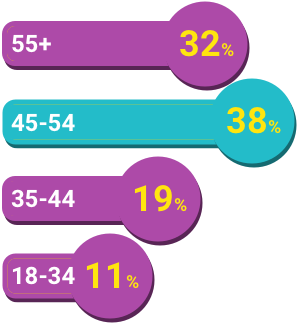
Age skews higher than the national median of 37.5 years.
Reading Habits
We used moderated, in-house user research sessions to analyze people’s physical and digital magazine reading habits using participants recruited from Nichols Research. Participants were asked to bring the magazines they had most recently read, and their primary devices for reading digital magazines.
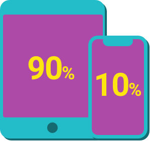
Participants who regularly read digital magazines read almost exclusively on tablet.

Most reading (physical & digital) occurred at home and later in the day.

Reading patterns were split between front-to-back reading and reading via cover stories.
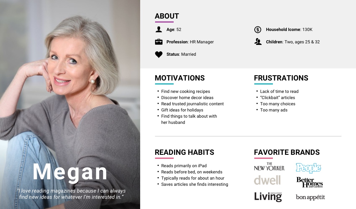
Building a Persona
Using the data shown above, we were able to construct our primary persona Megan.
Areas of Opportunity
Using our research findings combined with an analysis of competing services, we identified areas of opportunity for Texture to stand out.
-
Readers had to have an app for each title they were subscribed to.
-
Mobile magazine reading options were severely lacking.
-
Most magazine apps surveyed didn’t offer an offline reading experience.
-
Lack of curated content for users who have a limited amount of reading time or are between issues of their regular titles.

"What makes Texture such a beautiful app is the way it presents magazines."
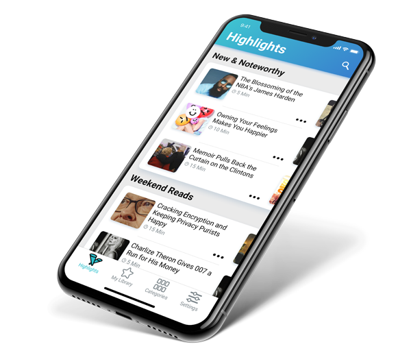
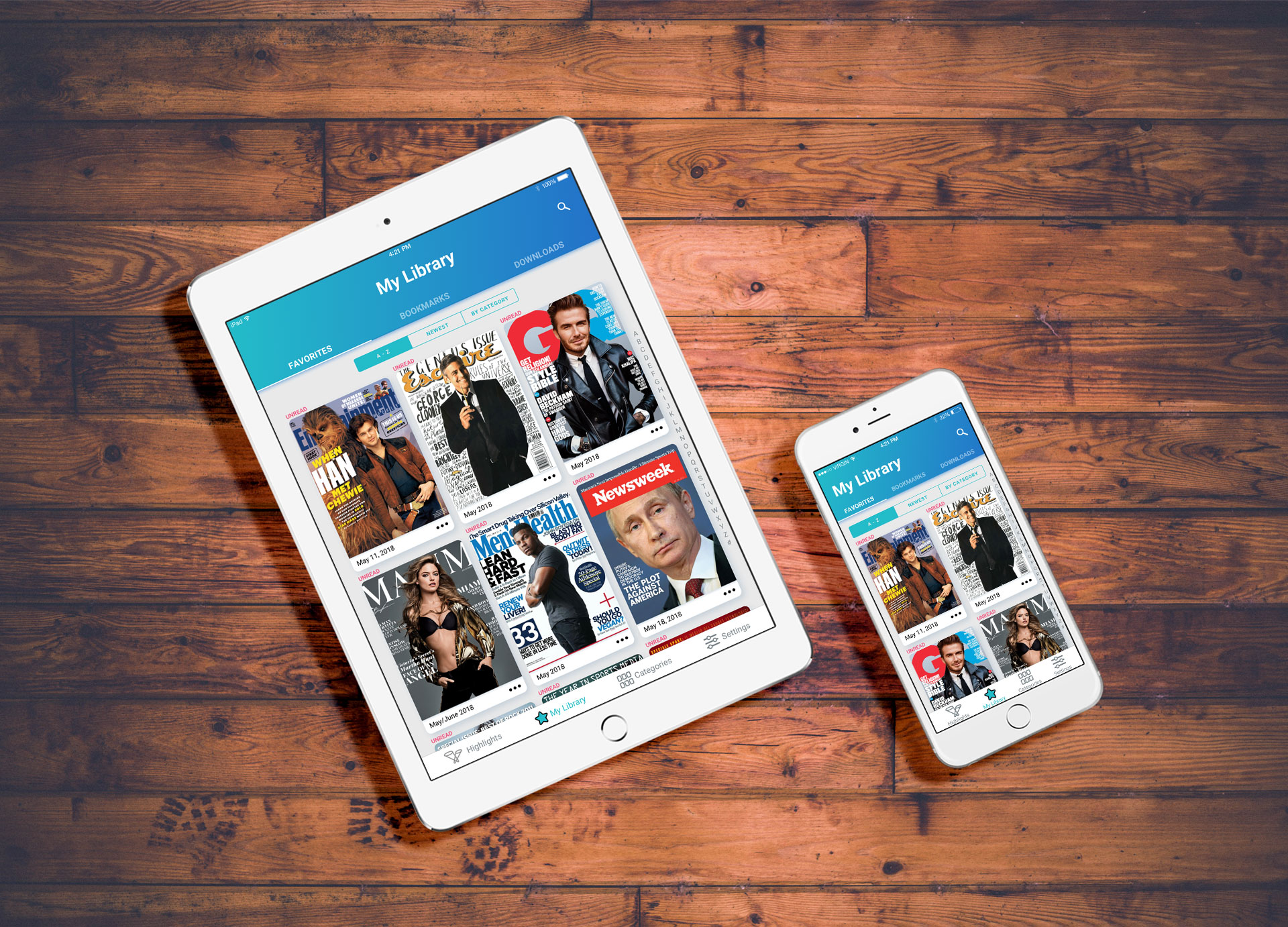
Design
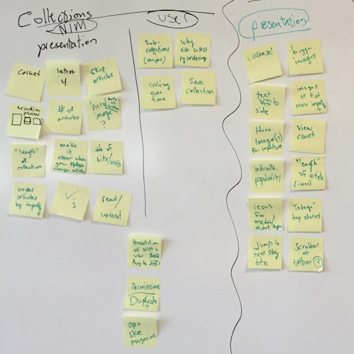
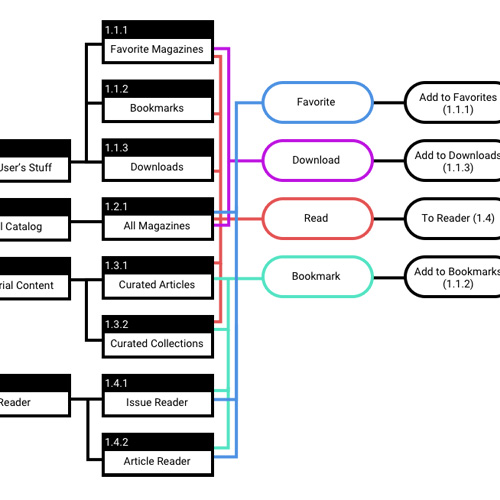
Library Architecture
I spent a lot of time exploring how content should be compartmentalized in the app. Techniques included card sorting exercises with remote participants using UserTesting.com, in person user testing sessions with low fidelity prototypes made with Principle, and of course lots of sketching. In the end we settled on three main buckets: 1) anything the user has taken some sort of action on to show their interest, 2) everything else in the catalog, and 3) disaggregated content curated by our editors for when users want a bite-sized reading experience.
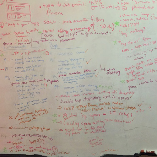
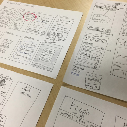
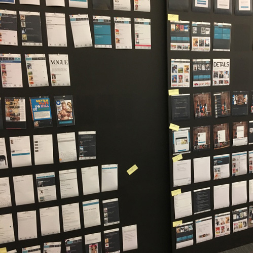
Process Shots, Click to Enlarge
Prototyping and User Testing
Prototypes involved different tools depending on what phase of production we were in at any given time.

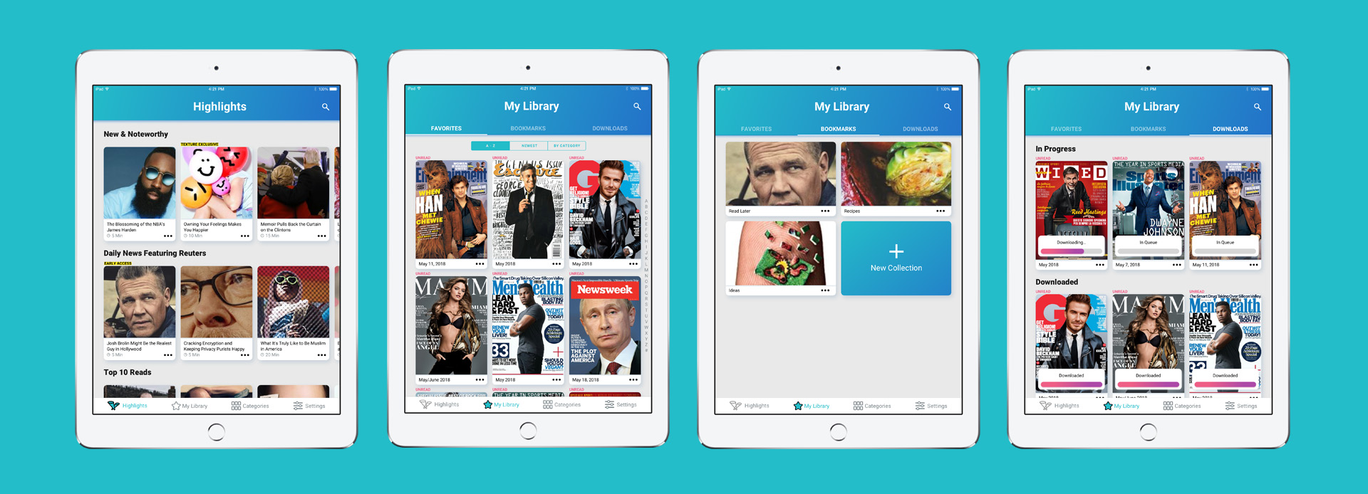
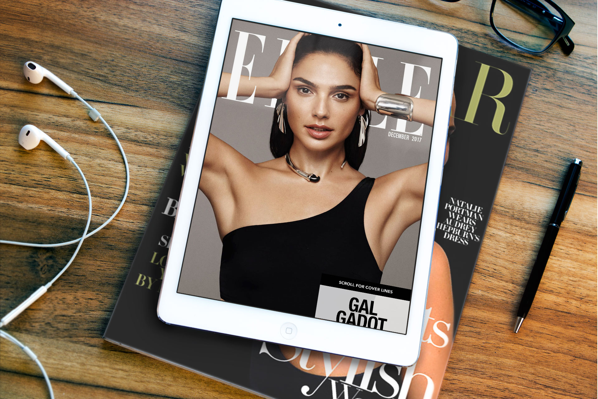
Final Designs - Tablet
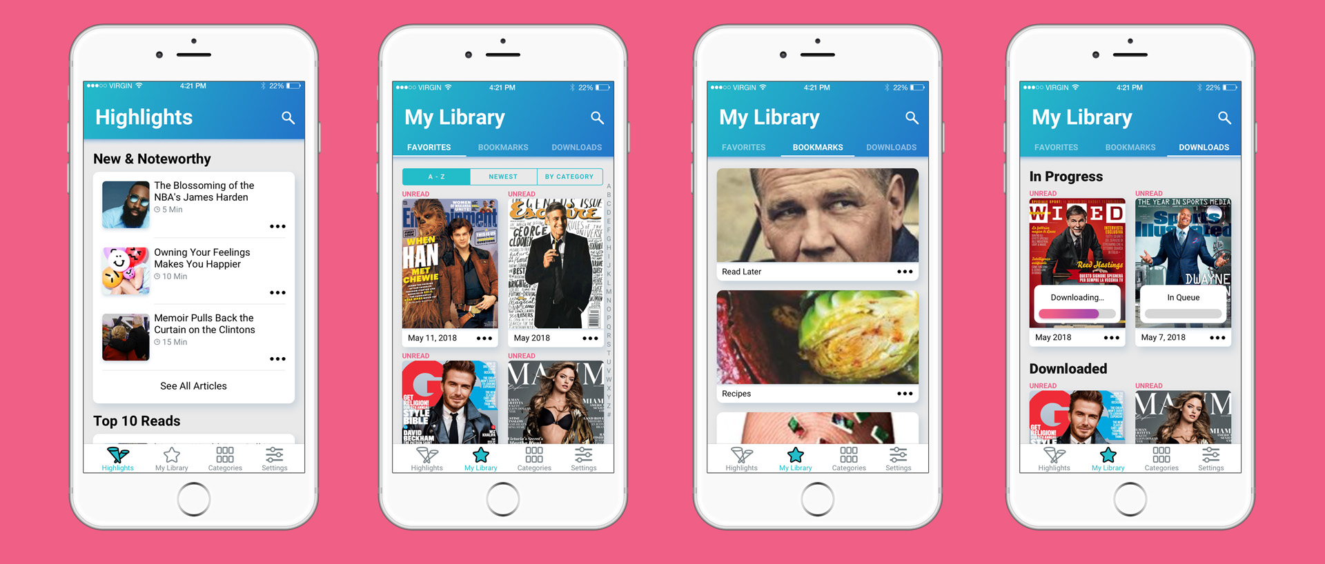
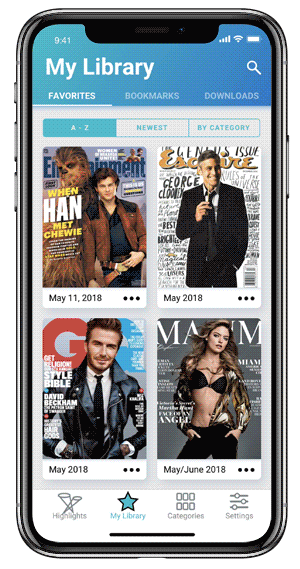
Final Designs - Mobile
"This is the best way to read magazines while traveling."
Converting to Paid
Texture has always positioned itself as a premium, subscription based service. At first our Executive team was hesitant to expose any of our library to non-subscribed users, but using Optimizely for A/B testing proved our hypothesis that increasing access boosted conversion. I relied on Apple’s built in Subscription Management API to make the sign up process as easy as possible. One area I think we could have improved on is removing the requirement for users to create a Texture account to subscribe, but foundational decisions made early on rendered that impossible from a technical standpoint.
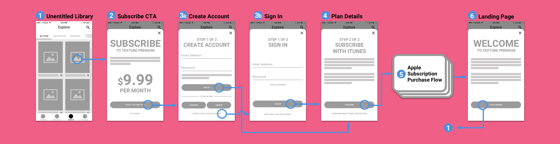
Wireframes - Mobile Purchase Flow
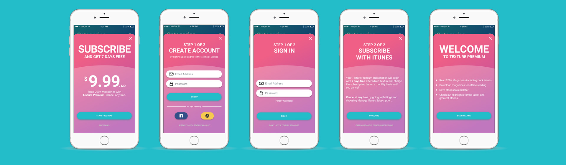
Final Designs - Mobile Purchase Flow
"It's so simple and intuitive, even non-techies can learn to use the app!"
Results
As print media declines, Texture has been hailed as the future of the magazine publishing industry. The value to the user is undeniable, as is the concentration of content from trusted journalistic sources. I’ve worked hard to make that content accessible and desirable. Our users love Texture, and it’s hard to argue with these results:

The service has consistently maintained a 4+ Star rating throughout its life on the App Store.

Texture secured a $50 million investment by leading global investment firm KKR.

We’ve sustained a 80-85 System Usability Scale (SUS) score throughout the life of the app.

Texture was acquired by Apple in 2018.
Next Case Study:
Redesigning Highlights
View Case Study