Redesigning Highlights
I updated the mobile Highlights UI to streamline navigation and boost engagement.
Texture
Platforms: iOS, Android
Disciplines: User Testing & Research, UX, UI, Wireframing, Prototyping
Often referred to as “The Netflix of Magazines,” Texture offers users unlimited access to over 200 magazines for one low monthly price.
The Challenge
The Highlights menu holds hundreds of editorially curated stories updated daily, divided among various categories such as New & Noteworthy, Weekend Reads, and Daily News From Reuters. Using Tableau for analytics we could see that click through and dwell time was much higher on tablet than on mobile. Tablet users on average when 3 times deeper into a feed to read content than mobile users. Our goals for a mobile Highlights redesign were to increase Highlights dwell time by 10%, and double feed depth.
The Team

Chris Pavia (myself)
iOS Design Lead

Theresa Chen
Android Design Lead

James Gerlach
Design Director
Research
Constraints
The Highlights menu contains a lot of content. Each category can hold up to 100 articles, and new articles are added on a daily basis. New categories such as holiday-specific feeds can be added at any time, and the order of feeds can be changed for A/B Testing or based on editorial needs. At one count Highlights contained upwards of 900 individual articles.
Analyzing the Current Design
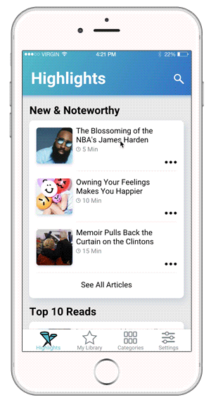
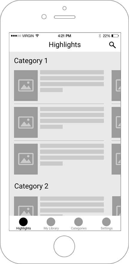
Our original mobile Highlights design consists of a vertical scrolling list of categories. Each category displays the three most recent articles, with a CTA to view the rest of the feed.
-
Unsurprisingly, up to 76% of dwell time in a category was spent in the top-level articles.
-
Click rates dropped by nearly 50% for any articles that required the user to tap the CTA.
-
The first 3 categories accounted for 80% of dwell time in Highlights, even when the feed order was changed.
Personas
From our original design work we had our primary persona Megan, but I wanted to see if this persona was still accurate in the context of mobile users who had visited the Highlights menu at least three times in the past 30 days. The data showed that these users were still predominantly female but skewed younger, lower income, and were more business focused than our primary persona. With this information I created our secondary persona Beth.
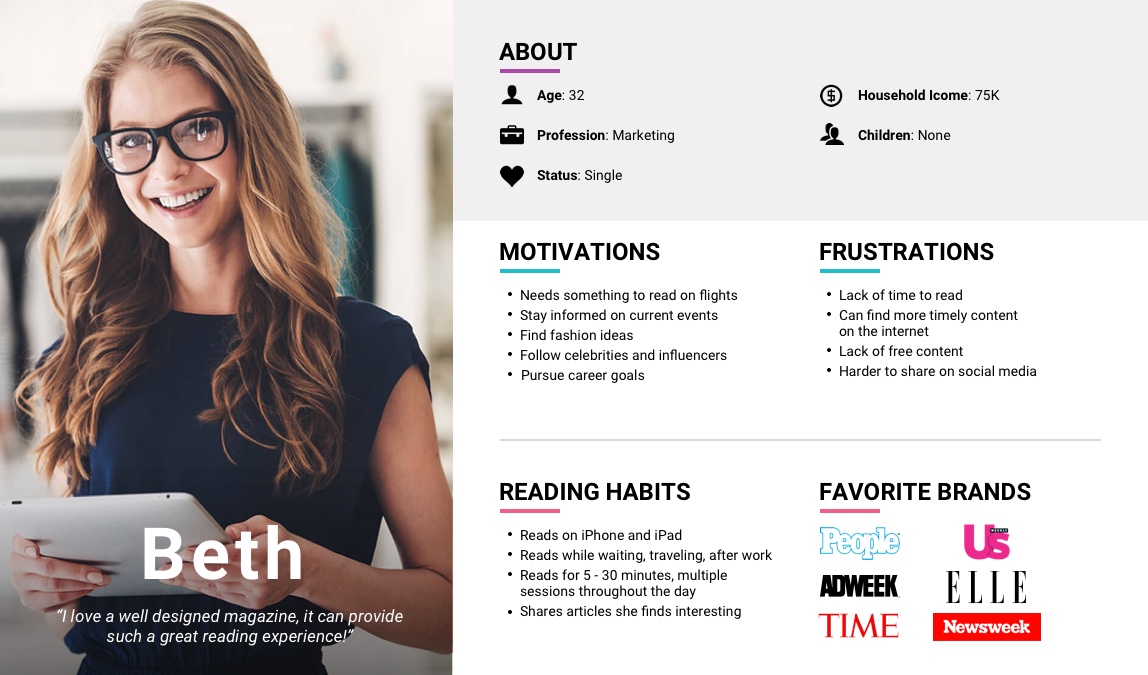
Secondary Persona: Beth
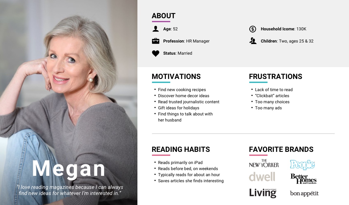
Primary Persona: Megan
Design Exploration
My primary consideration when exploring was to display all the articles in a category at once, as the “See All Articles” CTA proved to be a huge barrier for users. A secondary consideration was the importance of the article thumbnail vs the article title. After consulting our Editorial Team, we decided to keep the current ratio of title vs thumbnails so that wouldn’t affect any A/B testing of the navigation itself.
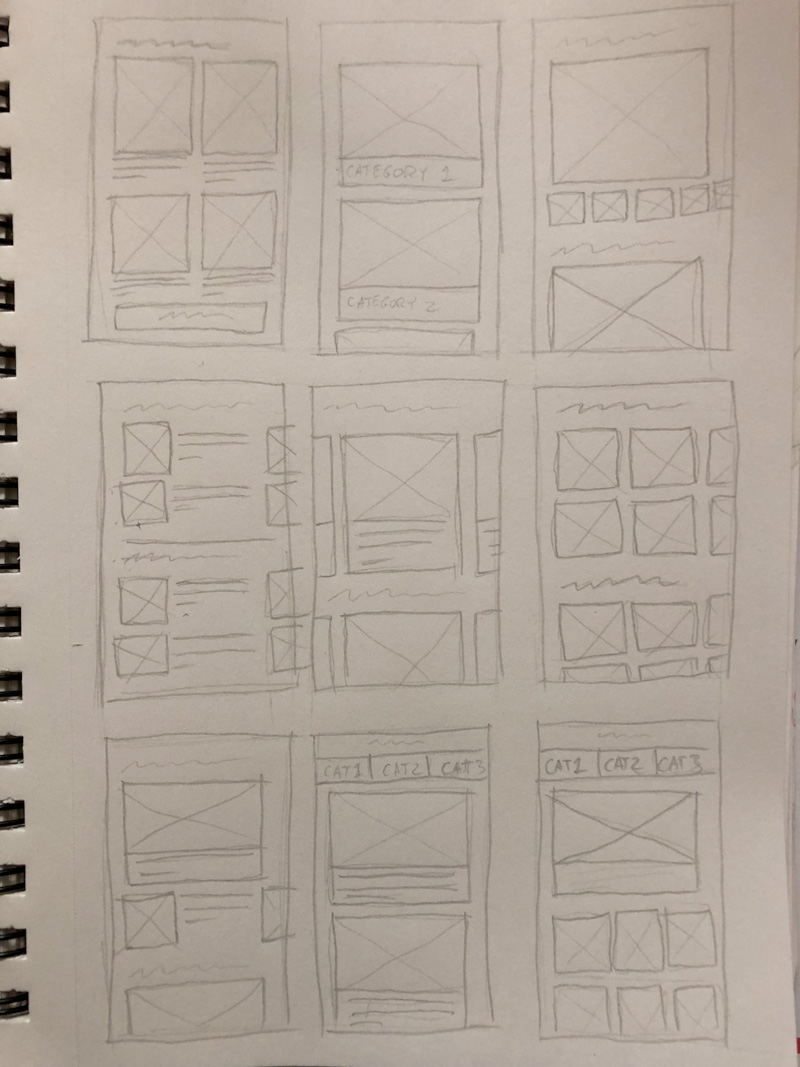
Sketching Phase
Wireframe
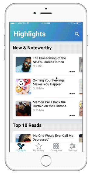
Final Design
The layout I landed on was inspired by the mobile version of the Apple App Store. The App Store had to solve the same problems I was looking at, a nearly endless amount of content divided into lots of categories.
The changes I implemented are:
-
The user no longer needs to tap into a feed, which allows the user to still see content from feeds other than the one they are currently browsing.
-
All stories in a feed are displayed in a horizontally scrolling 3-up carousel, allowing the user to move through content quickly.
-
The snap-to-nearest horizontal scrolling behavior helps alleviate issues that can be present in menus that allow both vertical and horizontal scrolling.
Results
After a month of A/B testing, the results were pretty clear:
15%
Dwell time increase
Increasing the “browsability” of Highlights led users to explore and read more articles per session, and read from more categories than before.
4X
Feed Depth
Scrolling feels like less of a commitment than drilling down into a separate menu, so users were going much deeper into each category.
“It's a pretty great way to find interesting editorials and long-form articles from publications you may not read regularly."
Next Steps
Given the success of our Highlights redesign, I feel the following features are worth considering:
-
Personalized Feed: Due to the overwhelming amount of content contained in Highlights, I would A/B test against a single feed populated with personalized content using Cohorts and Machine Learning.
-
Image-First Feeds: For shorter feeds such as “Top 10 Reads” I’d like to try a visual treatment that focuses on the image more than the article title.
-
Story-fied Content: Highlight video and multi-media content from influencers, similar to Snapchat and Instagram Stories.
Next Case Study:
Onboarding Refresh
View Case Study