Onboarding Redesign
I identified pain points in the onboarding flow and designed solutions to get users into the core experience faster.
Texture
Platforms: iOS, Android
Disciplines: User Testing & Research, UX, UI, Wireframing, Prototyping
Often referred to as “The Netflix of Magazines,” Texture offers users unlimited access to over 200 magazines for one low monthly price.
The Challenge
The Texture onboarding process involves users choosing an initial selection of their favorite magazines to populate their personal library. The user can change their favorites at any time, but looking at data from Tableau showed that the magazines picked during the onboarding process make up for about 80% of a user’s total dwell time in the app. Readers with a higher number of favorites also had a higher total dwell time. Our goal was to redesign the onboarding process to increase the average number of favorites picked by at least 25%.
The Team

Chris Pavia (myself)
iOS Design Lead

Theresa Chen
Android Design Lead

James Gerlach
Design Director
Research
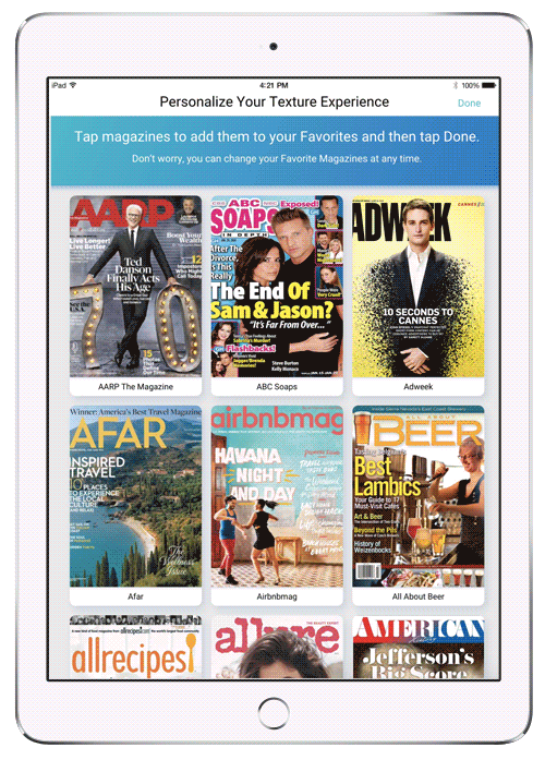
Analyzing The Current Design
Using Tableau, I knew that users selected an average of 12 titles during the onboarding process. At least three of those are usually titles the user already has a subscription to prior to joining Texture.
I used moderated, in house user research sessions to gain a better understanding of how people use the current onboarding design, and how it could be improved. Here were my findings:
-
There was too much instructional text at the top, causing many participants to skip it entirely.
-
Because we used live magazine covers, coupled with people not reading the instructional text, users often expected to start reading the magazine when they tapped on a cover.
-
Using an A-Z list of the entire catalog pushed many of the most popular magazines well below the fold.
-
Using actual covers led to the onboarding process taking much longer. The covers were engaging enough that users would spend more time looking at them than deciding which titles to select.
-
No search functionality.
-
The “Done” button was too small, it took some users too long to find it.
Design Exploration
After completing a competitive analysis of similar services that our primary persona Megan would be likely to use, I began the sketching and exploration phase.
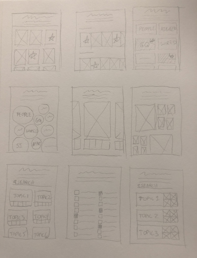
Sketching Phase
The design I decided to move forward with.
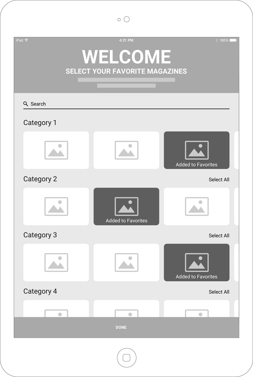
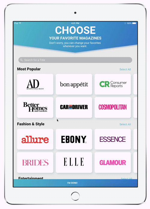
Final Design
When I had a design I was happy with, I met with the stakeholders to get buy in. This included the Engineering Team to determine any potential implementation issues, the Product Team to verify it met their needs, and the Executive Team to make sure our use of the brand marks met their guidelines. After a couple iterations based on their feedback I had my final design.
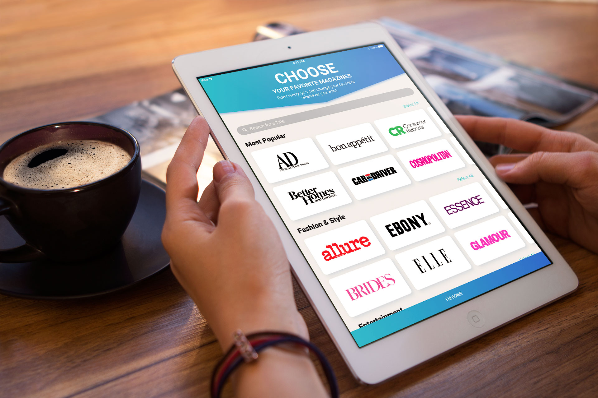
I made the following changes to remedy issues with the original design:
-
Reduced the amount of instructional text and highlighted the primary call to action verb.
-
Switched from covers to brand marks to focus on the brands themselves rather of the cover content.
-
Arranged titles by category so the popular titles could be surfaced higher.
-
Adding a search field was a requirement now that titles aren’t arranged strictly alphabetically.
-
Added a “Select All” option for each category.
-
Replaced the small “Done” button with a persistent button anchored to the bottom of the screen.
Results
The Good News
During user testing, participants selected an average of 18 titles, for a 50% increase in selected titles. We decided to move forward with implementation and A/B testing.
The Bad News
Unfortunately, when the company was acquired by Apple all development was halted and implementation of the new design was not completed.
Next Steps
Had we been able to complete implementation of the new design, there were a few next steps I would have liked to test:
-
Allow non-subscribers to go through the onboarding flow. My hypothesis being that allowing users to start customizing the experience (even if it’s with content they aren’t entitled to yet), they would be more likely to subscribe.
-
Use any available data to assign the user to a cohort before going through the onboarding process, so the order of categories can be configured to surface content they are interested in above the fold.
-
Allow users who sign up via the website to go through the onboarding process there so they are ready to read as soon as they sign in.
Next Project:
Daily 3D Renders
View Daily Renders